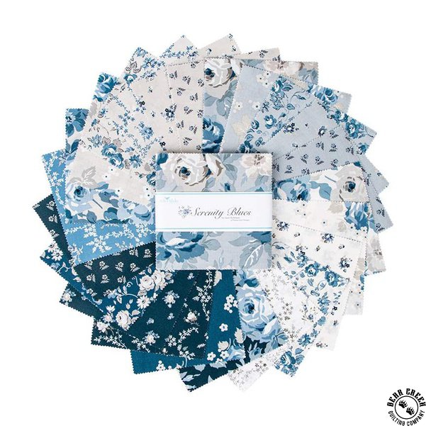


Serenity Blues by Gerri Robinson for Riley Blake Designs
Serenity Blues may look a bit familiar to some or possibly most of you and you would be correct. Serenity Blues represents my favorite prints from the original Serenity Collection introduced in 2019.
Based on a survey I did on my social channels; I was pleasantly surprised that most of you prefer a blue palette over a red palette which helped determine the palette for Serenity's new coloring. I LOVE how quick I can get answers to questions I spend way too much time pondering over. Oh, the convenience and power of social media; you gotta love it! Serenity Blues does not disappoint either. A mix of large, medium and small-scale florals in a soothing color palette of blues, taupe and creams will have you singing the blues too. I hope you love the REMIX of Serenity in Serenity Blues as much as I do. Speaking honestly, I love it more than the original! ~Gerri